Posters: Art, Information and Ideas on Display
Posters are a familiar part of everyday life. They appear in galleries, cafés, classrooms, shop windows and public spaces, sharing everything from event details to striking works of art. Combining words and images in a single format, a poster can inform, persuade or simply make us stop and look.
A brief history of the poster
As printing became more accessible, posters developed into an important way to reach large audiences. Artists and designers used bold colours, distinctive lettering and memorable illustrations to promote performances, products and public campaigns. Over time, the poster became more than a practical notice: it also became a recognised form of graphic art.
What makes a poster effective?
An effective poster communicates its main idea quickly. It often has a clear focal point, a considered use of colour and typography that is easy to read. The most important information—such as an event name, date or message—should be easy to find, even from a distance.
Images can set a mood or tell a story, while concise wording helps the message stay memorable. Good design brings these elements together without overcrowding the page. A poster does not need to be complicated to make an impression; often, a simple idea presented with care is the most powerful.
Posters as a form of art
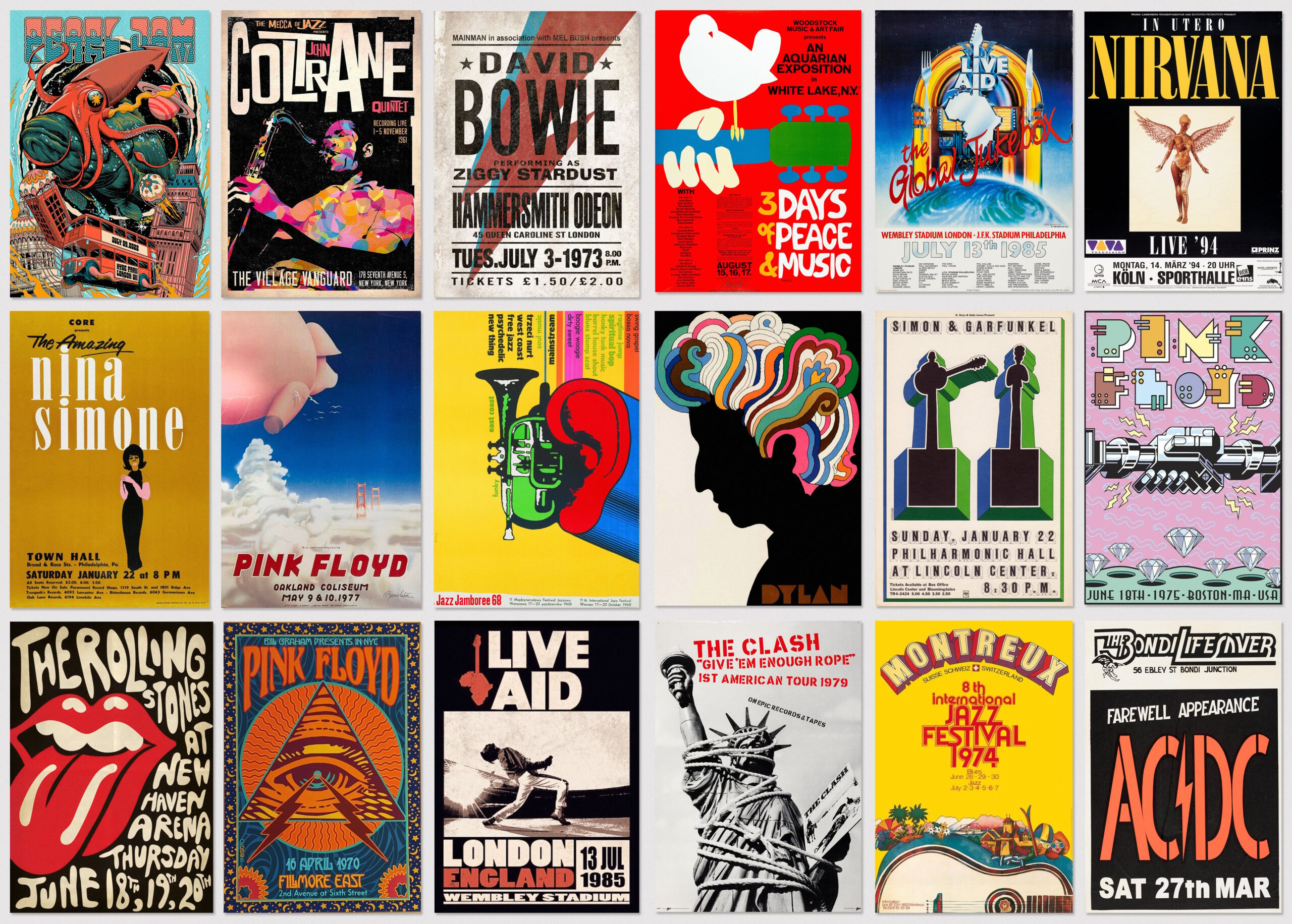
Many posters are created to be displayed for a limited time, but their visual appeal can last much longer. A carefully designed poster can capture the atmosphere of a concert, exhibition, film or moment in history. Collectors may value posters for their artistic style, cultural significance or personal connection to an event.
For artists and designers, posters offer an opportunity to experiment with composition, illustration, photography and lettering. Their familiar format makes them accessible, while their public display allows creative ideas to reach people beyond galleries and studios.
Posters in the digital age
Digital media has changed how posters are made and shared, but the format remains relevant. Printed posters still have a physical presence that can catch the eye in a public space. Digital versions can be adapted for websites and social media, helping a message reach people in different ways.
Whether printed on a wall or viewed on a screen, a successful poster brings visual style and clear communication together. It can announce, explain, inspire or invite—and, in just a few seconds, leave a lasting impression.
9 Tips for Creating Eye-Catching, Effective Posters
- Use a clear, catchy headline.
- Keep the message brief.
- Choose easy-to-read fonts.
- Use strong colour contrast.
- Include only useful details.
- Add a clear call to action.
- Use sharp, high-quality images.
- Check spelling and dates.
- Place posters where people will see them.
Use a clear, catchy headline.
Use a clear, catchy headline to make your poster stand out and help people understand its message at a glance. Keep it short, easy to read and relevant to the subject. Strong wording, paired with legible lettering and good contrast, can catch the eye and encourage people to read on.
Keep the message brief.
Keep the message brief so people can understand it at a glance. Focus on the most important information, use clear, simple language and avoid unnecessary details. A concise message is easier to read from a distance and more likely to stay in people’s minds.
Choose easy-to-read fonts.
Choose easy-to-read fonts so your poster’s message can be understood at a glance. Clear lettering helps people read key details from a distance, while simple typefaces keep the design tidy and accessible. Use decorative fonts sparingly, and make sure there is strong contrast between the text and background.
Use strong colour contrast.
Use strong colour contrast to make your poster easy to read and visually striking. Pairing light text with a dark background, or dark text with a light background, helps key information stand out—even from a distance. Choose colours that complement the poster’s message, and check that the text remains clear and comfortable to read.
Include only useful details.
Include only details that help the viewer understand the poster’s message. Keep the wording concise, highlight the most important information and remove anything that distracts from the main point. A clear, focused poster is easier to read and remember.
Add a clear call to action.
Add a clear call to action so viewers know exactly what to do next. Use direct, easy-to-understand wording such as “Book your tickets”, “Visit us today” or “Find out more”. Make the call to action stand out with a prominent position, readable type and strong contrast, and include any useful details—such as a website, QR code or deadline—to make taking the next step simple.
Use sharp, high-quality images.
Use sharp, high-quality images to make your poster look polished and professional. Choose visuals with enough resolution for the size you plan to print, so they stay clear rather than appearing blurry or pixelated. A crisp image can draw the eye, support your message and help your poster make a stronger impression.
Check spelling and dates.
Before printing or sharing your poster, check all spelling, names, times and dates carefully. A small mistake can confuse readers or make an event difficult to find, and printed errors can be costly to fix. Read the poster slowly, then ask someone else to review it with fresh eyes.
Place posters where people will see them.
Place posters where your intended audience is most likely to see them, such as community noticeboards, shop windows, cafés or busy corridors. Choose a spot with good lighting and little visual clutter, and make sure the poster is easy to read from a comfortable distance. Always ask permission before putting it up, and check that it will remain in place for the duration of your event or campaign.